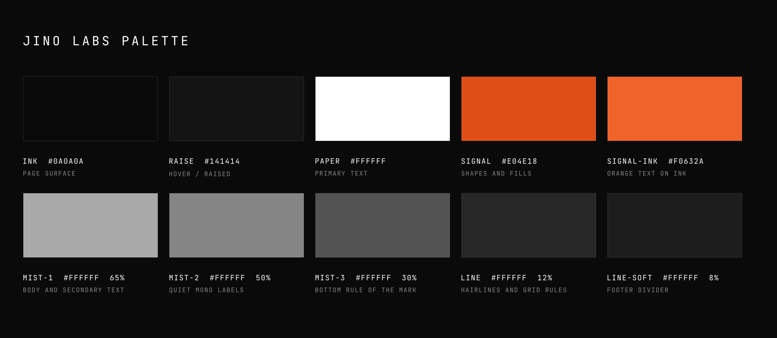
Three colours, two typefaces, one mark.
Everything below is what already ships on the site. If something is not in this document, it is not part of the brand yet. Add it here first.
The mark is three rules on a slope.
Top rule orange, middle white, bottom white at 35 percent. Skewed minus 12 degrees. Bar height is one unit, gap is 0.6 units, bar width is 5.8 units. It reads as stacked surfaces, which is what we build. The mark always sits to the left of the wordmark, on one line. There is no version with the mark on the right, above, or below.
Near-black page, white type, orange used sparingly.
There is no fourth colour, and the only gradient on the site is the hero's breathing glow. Orange exists in two steps. The base is for shapes and fills, the brighter step is for anything you have to read on the dark page.
Archivo for structure, JetBrains Mono for evidence.
Mono is the credibility cue with an engineering audience, which is exactly why it stays small. Labels, numbers, navigation, code. Never a paragraph.
Google Fonts · headlines and body
Google Fonts · labels, numbers, code
A 152px rail and a 920px column, both left aligned.
Nothing is centred. Sections are separated by a single hairline, never by a coloured band or a card with a shadow. Corners stay square.
mono index
and eyebrow
body copy capped at 660px inside it
page gutter clamp(24px, 5vw, 80px)
shell max width 1360px
Write it like a changelog.
Present tense, concrete nouns, numbers with units, technologies named. The reader is looking for a reason to close the tab, and every unsupported claim hands them one.
Three mechanical rules. No em dashes, no colons or semicolons in copy, and no claim without the evidence next to it.
Signing work that ships under someone else's org.
Four attribution badges, each as SVG and as a 2x PNG. The default is the hairline box, it survives any ground and reads at an 11px cap height. Use the shield in a README badge row and the banner across a full column.
The canonical form. Mark, then the attribution, on one line. Use these first and only reach for a container when the badge sits on a ground you do not control.
The default. Dark footers, docs, app chrome.
Light grounds. Middle rule flips to ink.
When the badge needs to be found, not just present.
Narrow columns. Mark still left of the block.
Where the link matters more than the name.
Presentation slides, wide README hero.
For footers, README headers, and any surface with its own noise. The border does the separating so the badge does not have to compete.
Footers on grounds you do not control.
The house card treatment. Signs a whole panel.
README badge row, next to CI and licence.
Sidebars and callouts. Rule instead of a box.
Sits on photography or a busy hero.
One per page at most. Launch posts, sponsor slots.
No mark. For places a graphic would be noise, a code comment, a CLI footer, a line of legal type.
Legal type, footers, print.
Generated file headers, config, source.
CLI output, install scripts, dev tooling.
Inside a paragraph of running text.
Contexts with a fixed shape. A square tile, a full-width banner, a vertical rail, a panel that has to sit on the hero gradient.
Avatars, favicons, social. Mark alone, 16px floor.
Top or bottom of a README, full column width.
On the hero gradient. Lets the ground through.
Page edge, sticky sidebar, poster margin.
The four that have to travel outside a browser, as SVG and as a 2x PNG. Everything above is markup, import it from components/powered-by.tsx instead.








Markdown for a README, the image wrapped in a link so the badge is clickable. GitHub strips CSS, so use the file rather than markup there.
[](https://jinolabs.xyz)